In my latest Codecademy project I was assigned to use Python and sklearn’s KNeighbor algorithm to find the attributes that could potential make a tweet go viral. But first a quick rundown on what is K nearest-Neighbor (KNN).
KNN is a great way to classify data. KNN takes in data points, and uniquely categorizes them into clusters. When using KNN you first feed into it known data, to train and classify the algorithm. In our example we will use Twitter’s API to aggregate the data we need. Afterwards we will be able to feed in a new tweet, and with a high degree of accuracy be able to know whether it is the kind of tweet to go viral. KNN places this new tweet on a graph, and sees which other data points on the plot it is most closely associated with.
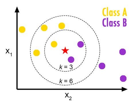
Above we have an example of KNN. It’s classified data into two groups: A and B. We then enter a new data point (the star) and according to it’s attribute place it accordingly on the graph. We then asked the algorithm to look at the 3 closest data points (k=3) and tells us how we should categorize this new data point. What do you see? What if we asked it to compare the star to it’s six closest neighbors (K=6)? How would the algorithm categorize it now? We’ll get more into that later, but for now let’s break down this Codecademy project.
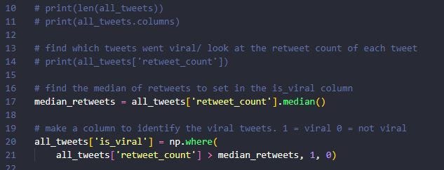
To begin I used panda to import the .json file which contained 11,099 tweets for me to analyze into a data framed named “all_tweets”. From there I needed to decide what constituted a viral tweet. I noticed a large extreme on the tweets that had been retweeted. It was either retweeted a bunch or a little, and not a lot in the middle. So I decide to use the median function on the “retweet-count” column -which came to be 13 retweets on average. With that information I created the “is_viral” column using numpy’s where function to create a “retweet_count” column represented by binary (either a 1 or 0).
The next step is to select which features of all the data I want to train my KNN model with. I decided to use: length of tweet, followers, number of friends, and hashtags to judge whether a tweet will go viral or not.
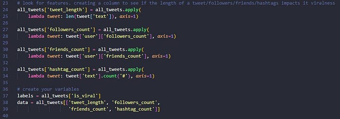
Next is to select my labels, which is whether or not a tweet is from the ‘is_viral’ column (now a 1 or 0). These will be compared to my selected data. However my data numbers for followers and length of tweet can be wildly higher than my 1’s and 0’s for is_viral. Here I will need to scale my data using the scale function.

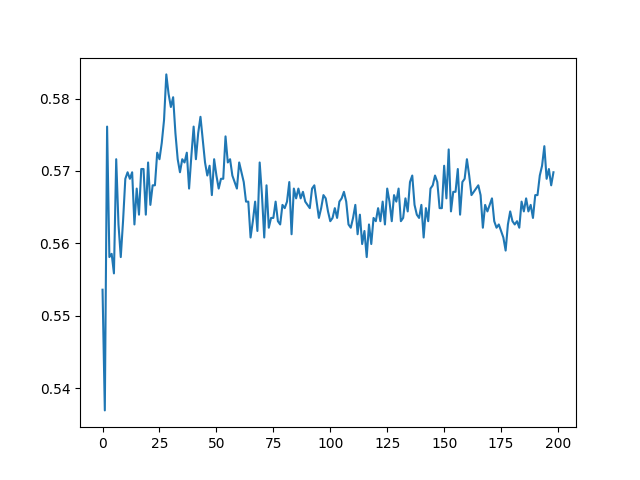
Great! Almost done. Now that I have my data I can use the train_test_split function from the sklearn.model_section to get my: train_data, test_data, train_labels, and test_labels. From here I’ll want to use the KNeighborsClassifier function from the sklearn.neighbors module to fit my train_data, and train_labels. Then I can score the the test_data, and test_labels to see what the accuracy of my algorithm is currently producing at. However KNN compares data to other data points on the graph, and as we saw in the first image KNN will come to a different conclusion if k=3 or k=6, so it’s always a good idea to play with this number. Below you’ll see that I put it in a for-loop with a range up to 200, and appended it to an empty list.
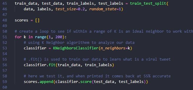
That’s it! Now I can just take that info and use matplotlib.pyplot to plot my results. It looks like when my K-neighbor is around 30 I have the highest accuracy rate (58%-ish). Perhaps I can find another attribute of a tweet and add it to my KNN for higher results, but at 58% I’m doing better than guessing!
