Most practitioners don’t like to mention it, but I’m just following the money, and nothing takes to data science like money. The well-off may like to preach the story of the self made man, but nothing is more adverse to risk-taking than established fortunes, and what is data science if not the most un-risky understanding of one’s situation? If you have spent any time using python to analyze data than you’d know what great revelations data scientist can have about the natural world. In this article let’s apply that to the market. Comrades, I’m here to spread a little light on the ways of the bourgeois.
In this article I’ll take a look at Netflix’s distribution of stock prices, their quarterly earnings, the actual vs estimated earnings, and comparison with the Dow Jones Average for the 2017 year. I’ll be using matplotlib, pandas, seaborn, and three .csv files. One with information on Netflix, Netflix Stocks Quarterly, and the third on the DOW.

I notice the column ‘Adj Close’ is just bourgeois speak for the ending price of the stock adjusted for dividends and splits. I’ll just use the .rename() function to change it to ‘Price’.
netflix_stocks.rename(column={‘Adj Close’: ‘Price’}, inplace=True)
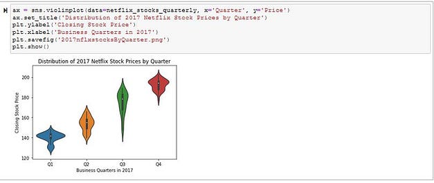
Now I want to see how Netflix stocks performed quarterly, and seaborn has a great violin graph to visualize this. In 2017 I can see the value steadily rose. The most unusual thing was the range of Q3. Although it was less volatile as a whole the range was much greater. Makes me wonder what was happening with consumers around the Q3 (July, August, September) time frame, or if there was any important business moves.

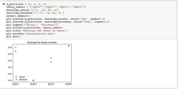
So did Netflix stock perform where investors thought it would be? I’ll use a scatter plot from matplotlib for the actual earnings versus the estimated earnings.

The predictions were pretty close, and dead on for the Q2 and Q4 earnings.
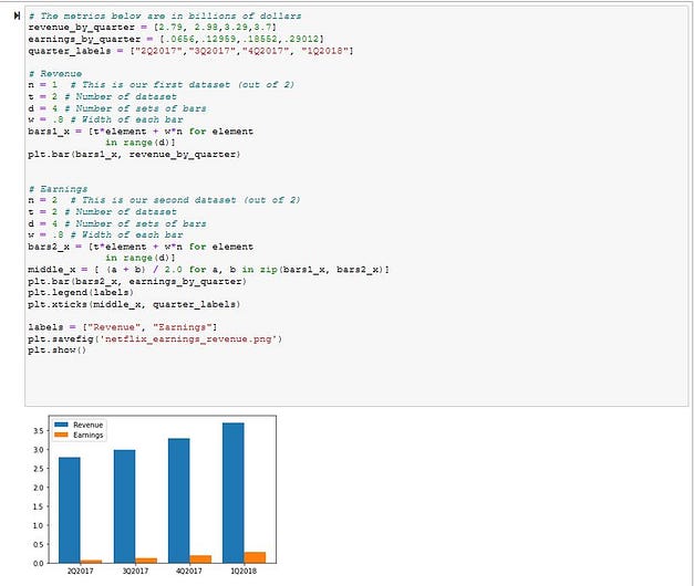
Now that I’m getting a good idea about Netflix what about their revenue? The numbers Netflix earns is impressive, but making all that content can’t be cheap either. I want to see a bar comparison of revenue versus earnings, and matplotlib has just the tool.

Wait, what? Am I looking at that correctly? I mean earnings do go up, but so does revenue which is already times higher to begin with!
I guess at that level it’s all monopoly money to begin with.
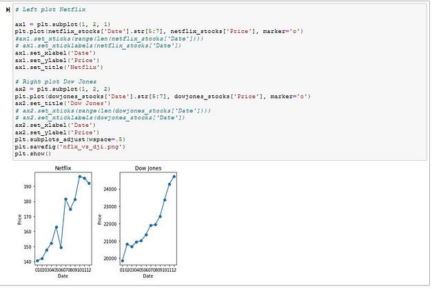
Let’s see how Netflix does in comparison to the rest of the DOW. For this I can use matplotlib to make two graphs side-by-side.

The DOW does seem to be more steady, and I can spot that large range Q3 had on the violin chart from earlier. Netflix is certainly rewarding early investors, and climbing fast. Quick my fellow proletarians it’s time to cash in on those tax-free capital gains!
There’s much more to analyze, and so many other parts of the market one can analyze. Python makes it easy to push your knowledge further, and I greatly encourage you to take some time to learn applicable projects like these. Who knows what you’ll find!
