Recently I was able to analyze some data from the National Parks Service on endangered species. This project had me using key functions of python to reshape data and plot graphs. Like any good data scientist being able to extract meaning from data is paramount, and as my quest to share knowledge grows, I hope these revelations can help point you to some helpful techniques to incorporate in your own journey.
For this project I imported pandas, and matplotlib as my module tools. Pandas to utilize it’s many functions, and matplotlib for the awesome graphs it provides.
I began by importing the two .cvs files (One for the observations. The second for the information on the species), and checking out the .dtypes. On the species table I decided to rename the ‘conservation_status’ to something simpler: ‘status’. I then looked at the type of statuses available.
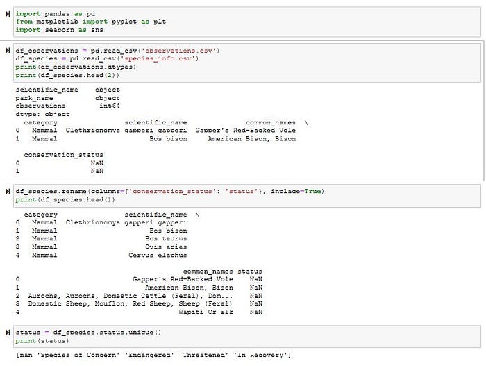
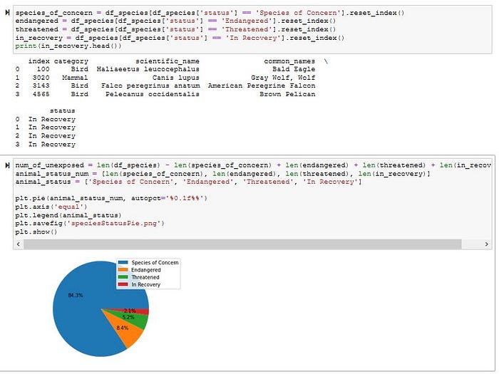
I then created 4 series objects — one for each status, and reset the index using .reset_index() to help secure a sequential order. I then made two lists. One with the length of each status, and the second with the corresponding status so I could plug these variables into a pie graph. I noticed that species with a non-endangered status comprised the majority (98%-ish), and left it out so the graph could give me a better look at what species of concern I should have.
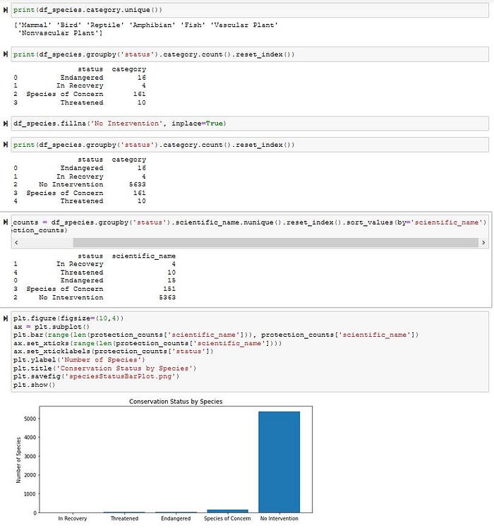
Next I wanted to see the category of species held in the table, so I used the .unique() function, and grouped them by their status. Since there were a lot of NaN statuses I filled in their column using the .fillna() function and the inplace=True attribute.
Before I go further let me explain this attribute. When altering tables such as this using the .fillna() function python wants to create a copy of the table automatically, thus not actually altering the original table, but creating a copy object. The default is inplace=False, so using inplace=True formats the original table, reducing the need to juggle multiple tables… unless that is your goal.
The less the better in my humble opinion though.
I then group by their statuses, and sorted by scientific_name, and of course reset their index. From there I used a bar plot to visual the conservation status of each species.
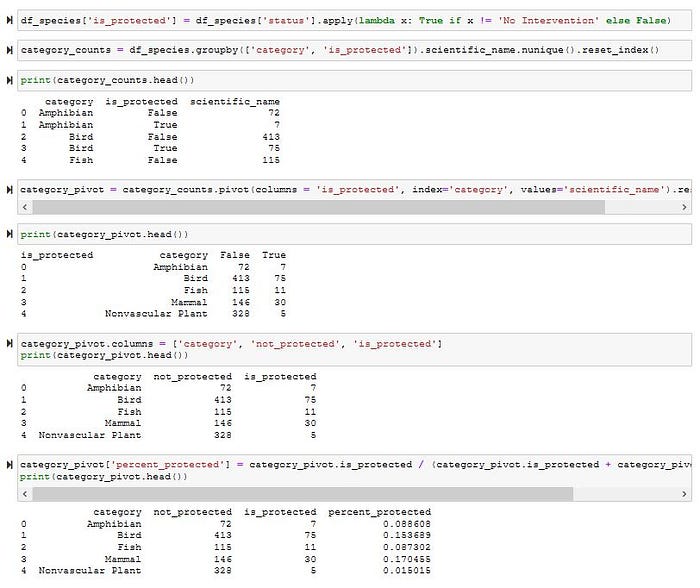
Great, now my curiosity is getting the best of me, and I want to know if a species is protected. I’ll use a lambda function and create a column called ‘is_protected’. I’ll then make a series object grouped by ‘category’, and ‘is_protected’. I’ll also add the ‘scientific_name’ column.
The new series object is good, but could be better. Using the .pivot() function I can adjust the table so I can better lay out the data in a more useful way, and make a new column representing the percentage of species protected.
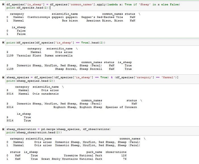
From here I’m going to look closer at what is happening with sheep, and use the observation table. I always liked their fluffy fur, so why not. I’ll create a ‘is_sheep’ column but applying a lambda function on the ‘common_names’ column.
After looking closer I notice there are some non-mammal species with the name ‘Sheep’ in their common name, so I’ll make a series object that filters out non-mammal categories. Next, I’ll use pd.merge() on my new series object with the observation table to make a new table called ‘sheep_observation’.
I can then make another series object that groups by parks, and takes in the sum of observation. This way I can see how many times a sheep was observed at that park. Once I have that it’s one easy step to make a bar plot to visual the results.
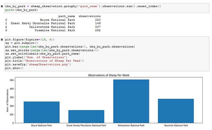
Sometimes I feel like python just makes it too easy. With some regular practice using panda methods and pyplot a garbled up table can really reveal an interesting story.
