In my latest article on data science I’ll go deep into using Seaborn. A visual module in python that charts different graphs for us. For my data-set I’m going to use the micro-loan nonprofit group Kiva to get a peek into how loans are distributed. If you want to follow along or find some other data sets to explore Kaggle is an excellent resource.
My usual suspect modules are: pandas, matplotlib, and seaborn. I can use pandas to help me better understand the data, so as usual I can exam the table thoroughly and decide how to proceed from there.
I used .columns, .unique(), .head(), and .dtypes to get some basic information. The columns were: loan_amount, activity, country, and gender. Seems fairly straight forward. Even the loan_amount column was an integer. Bless you Kaggle! There were five countries, and three activities. So to begin let me look at the gender discrepancy when it comes to loan distribution. I suspect that’s low hanging fruit. Seaborn’s sns.barplot() will help, and I can split the y axis using hue attribute set to gender.
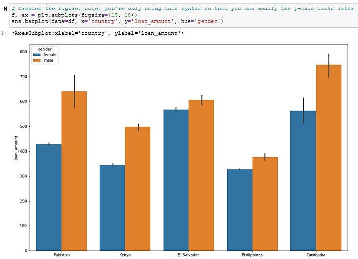
As I suspected men dominate the capital given to, and the closest to even is El Salvador. But now I’m curious about the median loan given to each country, and the ranges — sns.boxplot() can definitely show me this kind of information in an easy to digest visual.
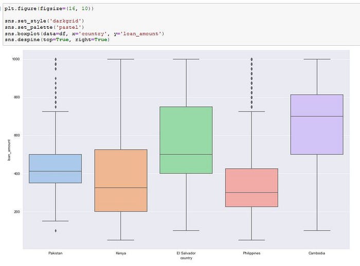
Excellent! From this I can see that Cambodia has the highest average loan. Could it just be more expensive to start a business there?
Pakistan and the Philippines have the most outliers. Kenya, El Salvador, and Cambodia seem to have the same size box so their ranges are comparable. What a great way to analyze the distribution.
Now I know there are three activities on the table: food production/sales, general store activity, and farming. Wouldn’t it be neat to see how the loan money is distributed among these.
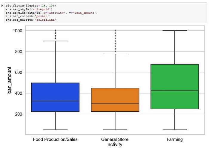
Okay, this is good, but now I want to see what size of loans are most frequently given for these activities. Boxplot are great for ranges, but a violin graph can give me more details. I also want to use the violin plot to get more details on the countries as well, so let’s do a second for that one as well.
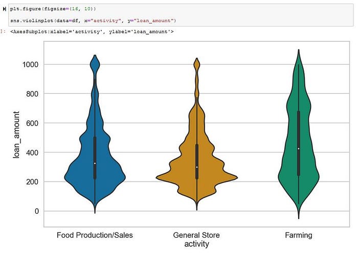
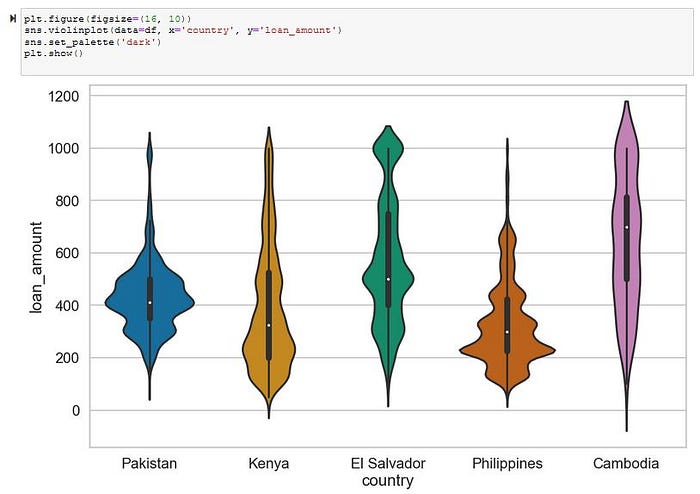
Great with these I can see which loan amounts were most like given to each country, and activity. Looks like in Pakistan the most common amount given was around $400 dollars. I wish I could see how this is divided by gender… What am I talking about of course I can. I’ll use the hue attribute on this violin graph has well.
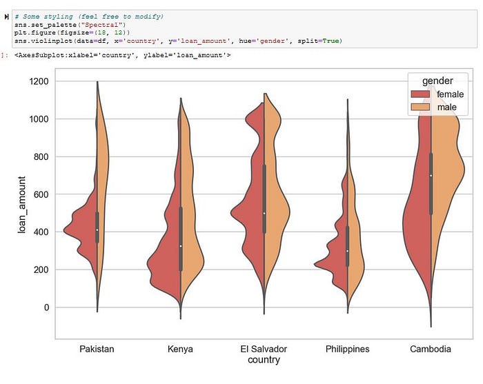
There we have it! What interesting things can you deduce from these? Looks like men get the most money, but the distributions are different. Men in Cambodia get larger loans, and have an upward trend. El Salvador seems to have equal trends, but with men borrowing more. This is very interesting, and could really lead someone at Kiva to look deeper into their loan program and see what is going on. Maybe there are good reasons for these trends, or some other variables they hadn’t accounted for that could really help them be more efficient in their noble mission.
Seaborn really does offer some exciting graphs to explore.
